15+ Best Types of Charts and Graphs for Data Visualization
By Marco Franzoni • March 4, 2024

Introduction: Navigating the World of Data Visualization
In an era where data is as abundant as it is crucial, the ability to decipher, understand, and present this data effectively is invaluable. Data visualization serves as a bridge between complex data sets and human comprehension, transforming numerical information into visual narratives. With a plethora of charts and graphs at our disposal, the task of selecting the right type to best represent our data can be daunting. This introduction aims to guide you through the vibrant world of data visualization, shedding light on the various types of graphs and charts designed to make your data not only seen but understood.
Data visualization encompasses a wide array of visual tools, each tailored to present data points in the most insightful way possible. From the simplicity of pie charts, which elegantly display parts of a whole, to the dynamic nature of line charts that trace changes over time, the choice of chart is pivotal in how data is perceived. Bar charts offer a straightforward method for comparing different groups, while column charts excel in showing data changes over a period. For more nuanced data sets, bubble charts and radar charts can reveal complex relationships and distributions.
But the journey doesn't stop at choosing between a bar graph or a line graph. Specialized charts like Gantt charts for project scheduling, waterfall charts for sequential data, and radar charts for multi-variable comparisons allow for a deeper dive into data analysis. Scatter plots excel in showcasing correlations between two variables, and stacked bar charts provide layers of information on the same chart, ideal for illustrating parts of a whole across different categories.
As we navigate through the types of graphs and charts, the goal remains constant: to visualize data in a manner that is both informative and engaging. Whether it's a single data set or multiple data sets, qualitative or numerical data, the art of data visualization lies in choosing the right chart that not only represents data accurately but also tells a story. Let's embark on this journey to uncover how each chart and graph type can illuminate different aspects of your data, making your analysis not just seen, but understood.
The Importance of Choosing the Right Chart Type
Why Chart Selection Matters in Data Presentation
The core of effective data visualization lies in the ability to choose the right chart type that best represents your data points and conveys the intended message to your audience. This choice is pivotal because it influences the ease with which viewers can understand and interact with the data. A well-chosen chart type enhances the readability of data, enabling viewers to quickly grasp complex information and underlying patterns. For instance, while pie charts are ideal for showing parts of a whole, line charts are better suited for illustrating trends over time. Each type of chart, be it bar, line, pie, radar, or bubble chart, serves a unique purpose and is capable of highlighting different aspects of data in ways that words or numbers alone cannot achieve.
Visualizing data effectively requires not just an understanding of the data itself but also an appreciation for the story you wish to tell. A mismatch between the data and its visual representation can lead to confusion, misinterpretation, and a dilution of the message. Therefore, the significance of chart selection cannot be overstated; it is the foundation upon which data visualization builds its capacity to inform, persuade, and engage.
Key Considerations for Selecting a Chart Type
When embarking on the journey of data visualization, several key considerations come into play in selecting the appropriate chart type:
- Objective of the Data Presentation: Identify what you want your audience to understand from the data. Is it to show a trend, compare values, illustrate distribution, or demonstrate relationships between data points?
- Nature of the Data: Consider whether your data is qualitative or quantitative, continuous or categorical, and how these characteristics influence the type of chart that will best showcase your data.
- Number of Variables: The number of variables and data sets you wish to compare also dictates the choice of chart. Some charts are better suited for a single data set, while others can effectively display multiple data sets.
- Comparison or Relationship: Determine whether the goal is to compare data points against one another or to show the relationship or trend among them. This decision can lead you to choose between bar graphs, line graphs, scatter plots, and more.
- Data Complexity: The complexity of the data can influence the chart selection. Complex data might require more sophisticated charts like radar charts for multi-variable analysis or stacked bar charts for detailed comparisons.
By carefully considering these factors, you can select a chart type that not only represents your data accurately but also communicates the intended message effectively. The right chart type brings clarity to data visualization, making it a powerful tool for analysis and decision-making. It transforms raw data into a visual story, making complex information accessible to everyone, regardless of their expertise in data analysis.
Most Common Types of Charts and Graphs to Communicate Data Points With Impact
Understanding the Audience and Data for Effective Visualization
The landscape of data visualization is vast, encompassing a wide array of charts and graphs each designed to showcase data points in the most impactful way. The key to leveraging these tools effectively lies not just in understanding the data, but also in knowing the audience. This dual comprehension ensures that the chosen method of visualization resonates well with the audience, making the data not only accessible but also engaging.
Bar Charts and Column Charts: Ideal for comparing the quantity of different categories or groups. These charts are straightforward, making them perfect for a broad audience. They visually represent data with horizontal or vertical bars, allowing for an immediate comparison of values across categories.
Line Graphs and Area Charts: Best suited for displaying data trends over time. They illustrate how values increase or decrease, offering insights into patterns or changes across a specified period. These graphs are particularly useful in financial presentations or when monitoring performance metrics.
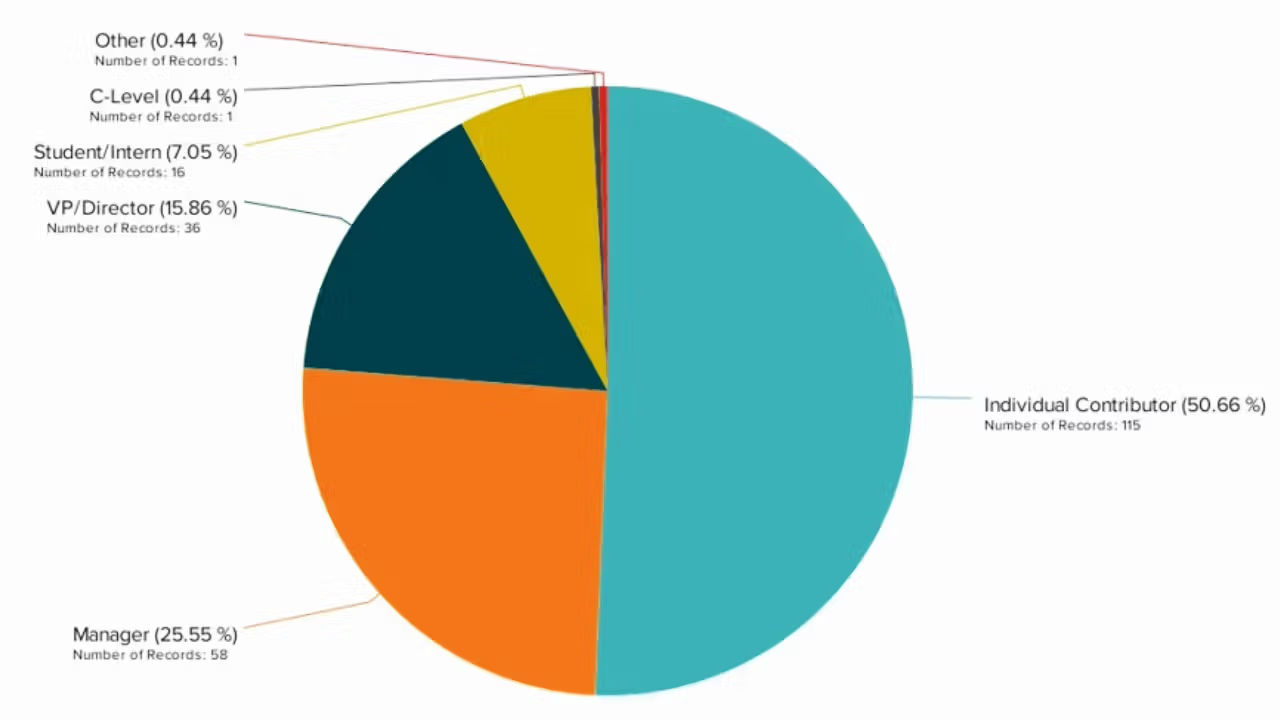
Pie Charts and Donut Charts: These are used to show parts of a whole. They provide a quick visual comparison of proportions and are most effective when presenting a limited number of categories to avoid cluttering.
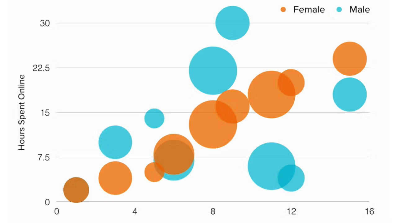
Scatter Plots and Bubble Charts: Excellent for depicting the relationship between two (scatter plots) or more (bubble charts) variables. They can highlight correlations, trends, or outliers within data sets, making them ideal for more analytical or scientific audiences.
Radar Charts: Useful for comparing multiple variables or categories, offering a comprehensive overview at a glance. They are particularly favored in performance analysis across different areas or competencies.
Gantt Charts: Essential for project management, showcasing schedules, and the progress of different tasks over time. They help in planning and tracking project timelines, making them indispensable for managers and team leads.
Heat Maps: Offer a visual representation of data density or intensity, using colors to represent values. They are useful in identifying patterns or concentrations in data, such as in geographical data visualization or website traffic analysis.
When selecting a chart or graph, consider not only the message you wish to convey but also the capacity of your audience to interpret that message. The complexity of the data and the familiarity of the audience with data visualization tools play crucial roles. A well-chosen chart simplifies the data presentation, enabling the audience to grasp complex data sets and the relationships between them quickly. In essence, the most effective data visualization marries the intricacies of data with the intuitive understanding of its audience, leading to informed decisions and insights.
Select the Right Type of Graph or Chart
Factors to Consider When Choosing Graphs and Charts
Selecting the right type of graph or chart is a crucial step in data visualization that can greatly impact the effectiveness of data communication. Here are key factors to consider to ensure that your data is represented accurately and comprehensibly:
1. Nature of the Data: The first consideration is the type of data you're working with. Numerical data, categorical data, time series, and hierarchical data each have charts best suited to their representation. For instance, line charts are ideal for time series data, while pie charts are better for showing the composition of a whole.
2. Objective of the Visualization: Identify what you want your audience to understand from the data. If the goal is to compare values, bar or column charts work well. For trends over time, line graphs are preferable. Understanding your visualization's objective helps in choosing the most effective chart type.
3. Number of Data Points and Variables: The quantity of data and the number of variables you wish to present should influence your choice. Scatter plots are excellent for visualizing the relationship between two variables across many data points, while bubble charts can add an extra dimension of data.
4. Audience's Data Literacy: Tailor your graph or chart to the familiarity and comfort level of your audience with data visualizations. Complex charts like radar or waterfall charts might be suitable for a technical audience, whereas bar or line charts might be better for a general audience.
5. Clarity and Simplicity: The best graph or chart is one that communicates your message clearly and simply. Avoid overcomplicating your visualization with too many categories or data series that could lead to confusion.
6. Comparison or Evolution Over Time: If you're showing data over time, line charts or area charts are effective. For comparing different categories, bar charts or column charts offer clarity.
By carefully considering these factors, you can select the graph or chart that best represents your data, making it accessible and understandable to your intended audience. Remember, the goal of data visualization is not just to show data but to tell a story that is clear and impactful.

Detailed Overview of Chart Types
This section provides a comprehensive overview of various chart types, each offering unique ways to represent data visually, catering to different needs and objectives in data visualization.
Bullet Chart
Bullet charts are a refined version of bar charts, designed to compare a primary measure to one or more other measures alongside qualitative ranges to assess performance. They're excellent for dashboard displays, providing a compact and rich data visualization that highlights progress toward a goal or compares multiple items in a small space.
Spider Charts (Radar Charts)
Spider charts, also known as radar charts, display multivariate data in a two-dimensional form. They are useful for comparing multiple variables or data points to understand strengths and weaknesses across different categories or entities. Each axis represents a different variable, and the data points are connected, forming a spiderweb-like appearance.
Stacked Bar Chart & Stacked Column Chart
Stacked bar and column charts extend the bar and column chart model by stacking data points on top of each other rather than side by side. This allows for the comparison of individual items as well as the total across different categories, making them useful for showing the composition of data over time or across different categories.
Scatter Plot Chart
Scatter plots display values for typically two variables for a set of data. The data is displayed as a collection of points, each representing the value of one variable determining the position on the horizontal axis and the value of the other variable determining the position on the vertical axis. Scatter plots are ideal for identifying correlations between variables.
Multi-level Pie Charts
Multi-level pie charts, or donut charts, allow for the representation of hierarchies and part-to-whole relationships across multiple levels. They are an extension of the basic pie chart, adding depth and context by nesting multiple layers of pie charts within each other.
Hierarchy Diagrams
Hierarchy diagrams are visual representations of data that is organized in a hierarchical structure. They are used to illustrate the structure of organizations, the breakdown of components, or any system of relationships that can be represented as a tree. Examples include organizational charts and family trees.
Step Line Chart
Step line charts are similar to line charts but with a key difference: the data points are connected with vertical and horizontal lines, creating a step-like progression. This type of chart is useful for displaying data where changes occur at irregular intervals but are significant when they do happen.
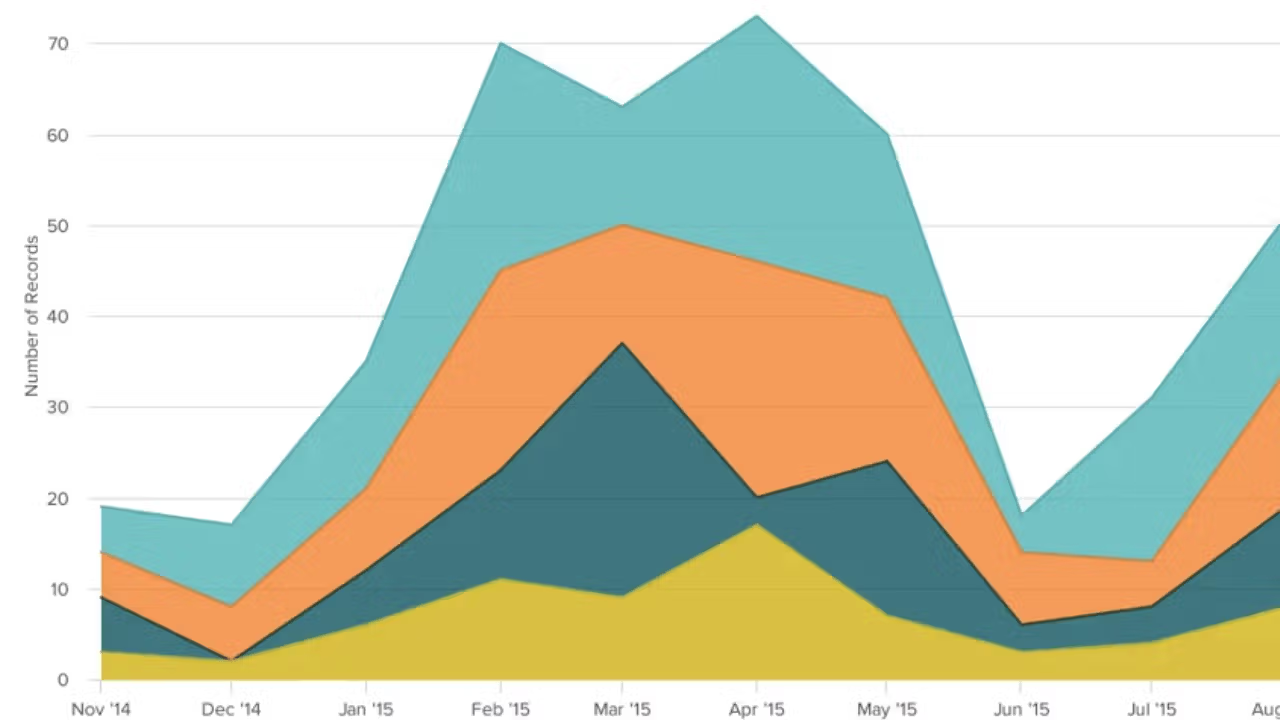
Stacked Area Charts
Stacked area charts are an extension of basic area charts, layering multiple data series on top of one another to show how individual categories contribute to the total over time. They're excellent for highlighting the magnitude of change over time and comparing the relative significance of multiple categories.
Contour Plots
Contour plots are used to display three-dimensional data in two dimensions, using contour lines to connect points of equal value. They are particularly useful in fields like meteorology, geography, and engineering to represent the topography of a landscape or variations in a surface.
Spline Chart
Spline charts are a type of line chart where the line is smoothed to display the data in a more visually appealing way. The smoothing can help in identifying trends more easily than with a traditional zigzagged line chart, especially when data is volatile or erratic.
Pyramid Chart & Funnel Chart
Pyramid and funnel charts are used to represent hierarchical data that needs to be ordered in a specific way. Pyramid charts are useful for visualizing foundational structures, while funnel charts are often used in sales to represent stages in a purchasing process, from initial contact to final sale.
Waterfall Charts
Waterfall charts are used to show a starting value and the effects of increasing and decreasing values over time or through a series of changes. They are particularly useful for financial data to track the cumulative impact of sequentially introduced positive or negative values.
Ridgeline Plot
Ridgeline plots, also known as joy plots, allow the visualization of the distribution of a quantitative variable for several groups, overlaying each group's distribution on top of each other. This makes it easier to compare the distributions and identify patterns or differences between groups.
Heat Map
Heat maps use color gradients to represent data values in a matrix or table. They are useful for visualizing the intensity of data across two dimensions, allowing for quick identification of hot spots or trends within the data.
Box Plot (Box and Whisker Plot)
Box plots are a standardized way of displaying the distribution of data based on a five-number summary: minimum, first quartile, median, third quartile, and maximum. They provide a visual summary of several statistical properties of a distribution, including its central tendency, variability, and skewness.
Venn Diagram
Venn diagrams are used to show all possible logical relations between a finite collection of different sets. They are useful for illustrating the relationships and similarities, as well as differences, between different data sets.
One Dimensional Heatmap
One-dimensional heatmaps are a simplified version of traditional heatmaps, used to represent data values along a single dimension with color intensities. They are effective for visualizing variances or patterns in data sequences, such as time series analysis.
Each of these chart types offers unique perspectives and insights into the data being analyzed, making the selection process critical for effective data visualization. Understanding the strengths and applications of each chart type enables more impactful and accurate representation of data, facilitating better decision-making and communication.
Best Use Cases for These Types of Charts: Matching Chart Types with Data Storytelling Needs
Data visualization plays a crucial role in data storytelling, enabling the clear and effective communication of insights. Different types of charts and graphs are suited to various data visualization needs, from illustrating trends and distributions to comparing data sets and highlighting hierarchical relationships. Here, we explore the best use cases for some of the most common chart types.
Pie Charts and Donut Charts
Use these to illustrate proportions within a whole, making them ideal for showing percentage distributions or the makeup of a single data set. They are best when the number of categories is limited to avoid clutter.
Bar Charts and Column Charts
Perfect for comparing numerical values across different categories or over time. Stacked variations of these charts can further break down these comparisons into sub-categories within each primary category, showcasing part-to-whole relationships.
Line Charts and Area Charts
Line charts excel in displaying data trends over time, highlighting increases, decreases, and patterns. Area charts, being similar but with the area below the line filled in, emphasize the magnitude of change over time.
Scatter Plots and Bubble Charts
Scatter plots are the go-to for examining relationships between two variables, identifying correlations, and spotting outliers. Bubble charts add a third dimension, size of the bubble, to represent additional variables.
Waterfall Charts
Ideal for understanding the sequential impact of positive and negative values on an initial value, commonly used in financial analysis to illustrate how revenue and expenses affect profit.
Radar Charts
Radar charts are useful for comparing multiple variables across different entities or categories, making them excellent for performance analysis across multiple criteria.
Heat Maps
Heat maps effectively visualize complex data sets through color variations, ideal for identifying trends, patterns, or variances in data, such as in web analytics or geographical data distribution.
Box Plots
Box plots are invaluable for statistical analyses, offering a concise visualization of data distribution, variability, and outliers across different categories.
Gantt Charts
Gantt charts are essential for project management, visualizing project schedules, and tracking the progress and overlaps of different tasks over time.
Funnel Charts
Funnel charts are best used to represent stages in a process, such as sales funnels, showing the reduction of data from one stage to the next.
Bullet Charts
Bullet charts are excellent for performance evaluation, comparing a primary measure (e.g., current performance) against one or more other measures (e.g., targets or past performance).
Hierarchical Data Visualization (e.g., Tree Maps, Hierarchy Diagrams)
These are crucial for illustrating hierarchical relationships within data, such as organizational structures or product categories, providing insight into the composition and structure of data sets.
Multiple Data Sets on the Same Chart
Combining multiple chart types, like line and bar charts, in a single visualization can illustrate complex relationships and comparisons across different types of data or variables.
Each chart type serves specific data visualization needs, from illustrating simple proportions with pie charts to analyzing complex hierarchical data with tree maps. The key to effective data storytelling lies in matching the right type of chart to your data visualization needs, ensuring that your data's story is communicated clearly and effectively.
Best Practices for Data Visualization
Effective data visualization is crucial for analyzing and communicating information clearly and efficiently. By adhering to best practices tailored to specific types of charts and graphs, one can enhance the interpretability and impact of data visualizations. Here, we outline best practices for some common types of data visualizations.
Best Practices for Scatter Plots
- Use Appropriate Scales: Ensure both axes are scaled properly to accurately reflect the distribution of data points.
- Limit Overplotting: For dense datasets, consider using transparency or jittering to prevent overplotting, where points obscure each other.
- Label Outliers: Identify and label outliers to provide insights into unusual data points.
- Incorporate Trend Lines: When appropriate, add trend lines to highlight the relationship between variables.
Best Practices for Bubble Charts
- Scale Bubbles Appropriately: The area of the bubbles should accurately represent the magnitude of the third variable, using a consistent scale.
- Avoid Clutter: Limit the number of bubbles to keep the chart readable.
- Use Color Wisely: Employ color to differentiate categories or to represent additional data dimensions, ensuring it enhances clarity.
- Provide Legends and Scales: Clearly indicate what sizes and colors represent with legends and scales.
Best Practices for Bar Charts
- Use Horizontal Labels: Horizontal labels prevent overcrowding and improve readability, especially for long category names.
- Start Axes at Zero: To accurately reflect the magnitude of values, always start the y-axis at zero.
- Avoid 3D Bars: 3D effects can distort perception of the bar lengths and should be avoided.
- Color Sparingly: Use color to highlight important data points or categories, not to decorate.
Best Practices for Stacked Bar Graphs
- Limit the Number of Layers: Too many layers can make the chart hard to read; simplify by combining categories if necessary.
- Use Clear Legends: Ensure that the legend is clear and matches the order of the categories in the stack.
- Highlight Key Data Points: Use contrasting colors or annotations to draw attention to important data within the stacks.
Best Practices for Gantt Charts
- Keep It Updated: Gantt charts should be updated regularly to reflect progress and changes in project timelines.
- Use Dependencies Wisely: Clearly indicate dependencies between tasks to show how delays can impact the project.
- Simplify: Avoid clutter by only including essential tasks and milestones, and grouping related tasks where possible.
Best Practices for Flow Charts
- Use Standard Symbols: Stick to universally recognized symbols to ensure your flow chart is easily understood.
- Keep the Flow Logical: Ensure the flow is logical and sequential, avoiding unnecessary complexity.
- Minimize Cross-overs: Design the chart to minimize lines crossing over each other to improve readability.
- Label Clearly: Every symbol should be clearly labeled to explain its function within the process.
Best Practices for Box Plots
- Display Outliers: Show outliers to provide a full picture of the distribution and identify any anomalies.
- Use Adjacent Value Lines: Mark the adjacent values (whiskers) clearly to indicate the range of the bulk of the data.
- Multiple Box Plots for Comparison: When comparing distributions across groups, align box plots side by side for easy comparison.
- Provide Context: Always include a legend or annotations to explain what the quartiles, median, and outliers represent.
Following these best practices for each chart type not only ensures that your data visualizations are aesthetically pleasing but also that they communicate the intended message effectively and accurately. This approach enhances the viewer’s ability to understand and engage with the data, making your data storytelling more impactful.
Are You Interested in Analyzing Trends in Your Data Set?
Analyzing trends in your data set is a crucial aspect of data analysis, allowing you to understand how variables change over time, identify patterns, and make informed decisions based on historical data. Data visualization plays a key role in trend analysis, offering a clear, visual representation of complex data sets and highlighting changes across different periods or categories. Here's how you can identify and visualize trends using various types of graphs:
How to Identify and Visualize Trends Using Charts
- Line Charts: Line charts are the quintessential tool for displaying data trends over time. Each line represents a series of data points connected by straight segments, making it ideal for showing the evolution of one or more variables. Use different colors or line styles to distinguish between multiple trends within the same chart.
- Bar Charts: While typically used for comparing quantities across categories, bar charts can also illustrate trends when categories represent time periods (e.g., months or years). Stacked bar charts or grouped bar charts can show trends across multiple data sets or variables over time.
- Area Charts: Similar to line charts, area charts emphasize the magnitude of change over time by filling the area beneath the line. They are particularly effective for visualizing cumulative trends, such as total revenue over several months or years.
- Scatter Plots: For datasets with numerous variables, scatter plots can help identify correlations and trends. When combined with trend lines (linear regression lines), they visually represent the relationship between two variables and the direction of the trend (positive, negative, or neutral).
- Bubble Charts: An extension of scatter plots, bubble charts can represent trends across three dimensions of data, with the size of the bubble indicating the magnitude of a third variable. This can be useful for visualizing complex relationships and trends involving multiple variables.
When visualizing trends, it's important to:
- Choose the Right Chart Type: Select a chart that best represents the nature of your data and the trends you wish to analyze.
- Keep It Simple: Avoid cluttering your chart with too much information. Focus on the key trends you want to highlight.
- Use Annotations: Labeling key points, trends, or anomalies directly on the chart can provide valuable context and insights.
- Consider Time Frame: The selected time frame can significantly impact the appearance of trends. Choose a time frame that is appropriate for the data and the analysis objectives.
By effectively visualizing trends in your data set, you can uncover valuable insights, predict future patterns, and make data-driven decisions with confidence.
Types of Graphs: FAQs
When it comes to data visualization, understanding the variety of graphs and charts available is crucial for effectively presenting and analyzing data. Here are some frequently asked questions (FAQs) that shed light on the types of graphs and charts, and the distinction between them.
What are the 4 types of graphs?
- Line Graphs: Line graphs are used to display data points over a continuous interval or time span. They are ideal for showing trends in data at equal intervals and are often used in financial services, sales, and the sciences.
- Bar Graphs (or Bar Charts): Bar graphs are used to compare different sets of data across categories. Each bar represents a category of data, and the height or length of the bar corresponds to the value it represents. Bar graphs can be vertical or horizontal.
- Pie Charts: Pie charts are circular graphs divided into sectors or 'slices,' each representing a proportion of the whole. They are best used to show percentage or proportional data and are common in business and media for displaying market shares or budget allocations.
- Histograms: Histograms are similar to bar graphs but are used specifically for showing frequency distributions of variables. They are useful in statistics to depict the distribution of data points across different ranges.
What are the 7 types of charts?
- Line Charts
- Bar Charts
- Pie Charts
- Histograms
- Scatter Plots: Used to show the relationship between two variables by displaying data points on a two-dimensional graph.
- Area Charts: Similar to line charts, but the area under the lines is filled with color or patterns, emphasizing the volume.
- Bubble Charts: An extension of scatter plots, where each data point also has a size dimension, allowing for the visualization of three data variables in two dimensions.
What is the difference between a graph and a chart?
The terms "graph" and "chart" are often used interchangeably, but they have distinct definitions. A graph is a type of chart but specifically refers to a data visualization that represents mathematical relationships between sets of numbers. Graphs are typically used in scientific and mathematical contexts to show variables or changes over time.
On the other hand, a chart is a broader term that includes graphs among other visual representations of data, such as pie charts, bar charts, and flow charts. Charts are used in a variety of fields to present data or information in a structured form, making it easier to understand complex data sets or relationships.
By choosing the appropriate type of graph or chart, data can be presented in a way that is both informative and visually appealing, enhancing the viewer's ability to understand and analyze the data.
Conclusion: Empowering Your Data Visualization Journey
Embarking on the journey of data visualization opens a realm where data becomes not just numbers, but stories waiting to be told. Throughout this exploration, from chart selection to effective application, we've navigated through the essential landscapes of charts and graphs, each serving a unique purpose in the storytelling of data. The choice between a bar chart, a line graph, a pie chart, or any of the numerous types available can dramatically affect the perception and understanding of your data.
Key takeaways include the significance of selecting the right chart type to convey your message effectively and the nuances of various charts and graphs designed to represent data accurately. We delved into common and advanced types of charts, highlighting their best use cases and aligning them with specific data storytelling needs. Through detailed overviews, we've seen how each chart type, from bullet charts to heat maps, can illuminate different aspects of your data, offering insights that might remain obscured in a less fitting visualization.
Best practices in data visualization remind us of the importance of clarity, accuracy, and the audience's needs. These principles guide the selection process, ensuring that your data not only informs but also engages. Whether you're analyzing trends, comparing data points, or illustrating complex relationships, the right chart can transform raw data into compelling visual narratives.
As we conclude, remember that the power of data visualization lies in its ability to make the invisible visible, transforming abstract numbers into visual stories that resonate. With the insights from "17 Best Types of Charts and Graphs for Data Visualization," you're now equipped to embark on your own data visualization journey, empowered to choose the right tools to bring your data to life.