User Interface Design Examples For User-Friendly Websites
By Marco Franzoni • May 11, 2024

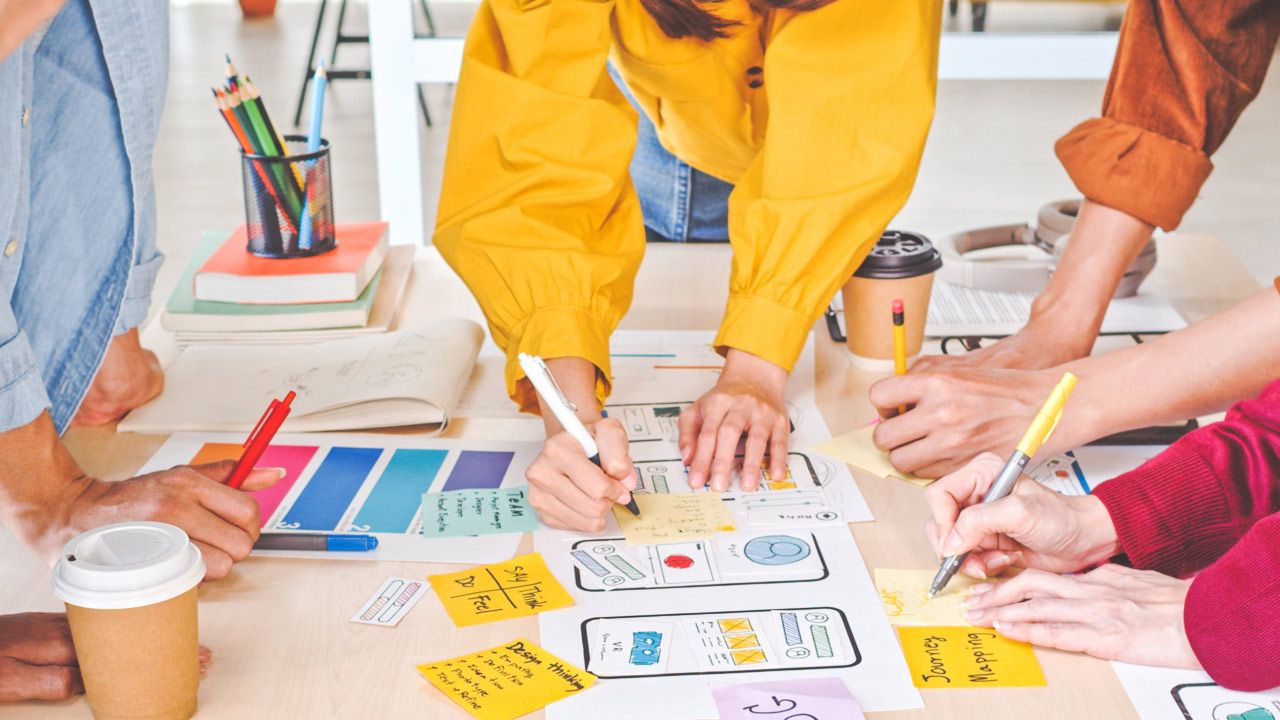
Introduction: The Importance of User-Friendly UI Design
Why Focus on User Interface Design?
In today’s digital age, the user interface (UI) serves as the bridge between users and technology. A well-crafted UI not only captures the user’s attention but also facilitates smoother interactions with applications, whether on mobile apps or web platforms. By focusing on user interface design, designers can create intuitive user journeys that engage users effectively, making every interaction both enjoyable and efficient. This emphasis on UI design helps in reducing the learning curve and improving user retention, crucial metrics for any digital product's success.
The Impact of Well-Designed UI on User Experience
The impact of a well-designed UI on user experience cannot be overstated. When users interact with a website or app, their satisfaction hinges on the responsiveness and aesthetic appeal of the interface. Good user interface design prioritizes the needs and preferences of the end-user, ensuring that the design is not only visually appealing but also functionally robust. From the use of engaging layouts and dynamic color systems to incorporating responsive design principles, every element works together to enhance user satisfaction and ensure that users complete tasks effortlessly and with pleasure.
Integrating the 10 Rules of Thumb for UI Design
Integrating the 10 rules of thumb for UI design into every project is pivotal for creating successful UIs. These rules, which include maintaining consistency in branding, optimizing readability, and minimizing cognitive load, serve as the backbone for developing interfaces that are not only aesthetically pleasing but also highly functional. By adhering to these guidelines, UI designers can craft interfaces that invite users into a seamless and productive digital experience. These foundational principles help in creating a solid starting point for both new and seasoned designers to innovate while maintaining usability standards.
This introduction sets the stage for a deeper exploration into the various facets of UI design, showcasing examples and principles that highlight how strategic design can lead to more engaging and successful user interfaces.

Key Elements in Exceptional UI Design System Examples
Applying the Rules of Thumb in UI Design
Exceptional UI design hinges on a deep understanding and application of core design principles that ensure functionality and aesthetic appeal. Key elements of outstanding UI design include a clear hierarchy of visual elements, consistency in color gradients, and a strategic use of UI elements that enhance the user interface. By employing a dynamic color system and engaging layouts, designers can create visually appealing interfaces that not only capture the user's attention but also facilitate an intuitive user journey.
Utilizing responsive design ensures that UI adapts gracefully across different devices, offering a seamless experience whether on a desktop, a mobile app, or a tablet. This approach, paired with a commitment to clear visual cues and minimalistic design, serves as a great example of how the foundational rules of thumb can lead to successful UI design, effectively engaging users and meeting their expectations in a visually cohesive and functional manner.
User Interface Design Examples: Mailchimp's Usability
How Mailchimp Applies UI Principles for Enhanced Usability
Mailchimp stands as a paragon of user interface design, skillfully integrating key UI principles to enhance usability and ensure a seamless experience for its users. At the core of Mailchimp’s design strategy is consistent branding, which establishes a familiar and reassuring presence that users recognize across various platforms, from web UI to mobile apps.
The platform excels in utilizing an intuitive user journey through carefully crafted navigation and interactive elements that invite users to explore its features with ease. Mailchimp’s use of white space and a delicate color match enhances readability and minimizes cognitive load, allowing users to focus on completing tasks without distraction.
Feedback mechanisms are seamlessly integrated into the design, providing users with immediate and relevant responses based on their actions. This not only boosts user engagement but also fosters a sense of accomplishment and satisfaction. Mailchimp’s commitment to these design principles makes it one of the best UI design examples, demonstrating how thoughtful design can significantly improve user experience and retention.
Notion's Onboarding Screen
Simplifying User Entry Points According to UI Guidelines
Notion's onboarding screen exemplifies how to effectively simplify the entry point for first-time users, adhering to UI guidelines that promote an intuitive user journey. Notion employs a minimalistic design that removes unnecessary clutter, allowing new users to focus on essential features without feeling overwhelmed. This approach not only enhances the user's journey by reducing the learning curve but also ensures that users feel competent and confident as they navigate through the app.
The onboarding process is designed with clear, concise instructions and visual cues that guide users through initial setup steps, making the start of their Notion experience as straightforward as possible. This successful UI design leverages bright colors and generous line spacing to create a visually appealing and easy-to-read interface that invites users to engage and explore deeper into the application.
By focusing on these key elements, Notion’s onboarding screen sets a solid starting point that helps prevent users from feeling lost, effectively fostering early engagement and long-term retention.

Figma's Helpful Tips for Beginners
Educating Users Through Interface Design and Accessibility
Figma stands out as a tool that significantly flattens the learning curve for new users through its thoughtful interface design and accessibility features. For beginners, Figma provides a set of helpful tips and tutorials that are integrated directly into the UI, offering concise instructions and visual cues that are easy to follow and understand.
These educational elements are designed to enhance users' design skills incrementally, allowing them to learn at their own pace without feeling overwhelmed. The use of favorite UI design examples within the platform serves as great inspiration, showcasing what can be achieved and how various elements can be effectively utilized in a design project.
Figma's approach to educating users extends beyond simple tool tips to include fun illustrations and engaging layouts that make the learning process enjoyable and visually appealing. This commitment to user education not only helps new users get up to speed quickly but also ensures that they are equipped to make the most out of the powerful design features Figma offers, ultimately fostering better user retention and satisfaction.
Checklist for a Great UI Design
Essential Components for Effective UI Following Design Rules
Creating a great user interface (UI) involves more than just aesthetic appeal; it requires a deep understanding of key features that make designs both functional and engaging. Here's a checklist of essential components for effective UI, adhering to well-established design rules:
- Clarity and Simplicity: The UI should be clear and simple, allowing users to understand how to navigate and interact without confusion. This includes the use of familiar patterns and visual cues that guide the user seamlessly through their journey.
- Responsiveness and Adaptability: An effective UI must perform well across different devices and platforms. Responsive design ensures that the UI elements adjust appropriately to different screen sizes, providing a consistent experience whether accessed via mobile, tablet, or desktop.
- Consistent Branding and Visual Elements: Consistency in visual elements and branding helps build trust and recognition. This includes maintaining a consistent color palette, typography, and layout styles throughout the application.
- Engaging Layout with Intuitive Navigation: The layout should invite users to interact, with strategic placement of key features and navigation elements that make sense to the end-user. Engaging layouts often use dynamic color systems and thoughtful arrangement of content to draw the user's attention to important actions.
- Accessibility and Inclusivity: Accessibility should be a cornerstone of UI design, ensuring that everyone, regardless of ability, can use the application effectively. This includes options for adjusting text size, color contrast settings, and voice communication features for those with different needs.
- User Feedback and Interaction: It's crucial to have mechanisms in place that provide immediate feedback to the user's actions. This could be through subtle animations, changes in color, or visual indicators that confirm an action has been completed.

By incorporating these elements into your UI design, you establish a solid starting point that not only meets the basic functional requirements but also enhances user engagement and satisfaction.
Spotify's Color Palette for Different User Interfaces
The Role of Color in User Engagement and Visual Hierarchy
Spotify's use of color is a masterclass in enhancing user engagement through a well-thought-out visual hierarchy. The platform utilizes an impressive color palette that includes Spotify's signature color gradients, which not only define its brand identity but also guide users naturally through the interface.
This dynamic color system plays a critical role in differentiating sections of the app, highlighting interactive elements, and indicating the status of user interactions, such as playing or pausing tracks. The responsive color palette ensures that visuals remain effective and appealing across different devices and lighting conditions, enhancing the overall user experience.
Furthermore, the strategic use of color gradients helps to create an engaging layout that invites users to explore deeper into the app. The careful selection of bright colors against darker backgrounds increases readability and focuses the user's attention on key features. By effectively managing the visual load, Spotify ensures that the user's journey through the app is both intuitive and aesthetically pleasing, making it a great example of successful UI design in action.
Headspace's Accessibility Options
Making UI Design Inclusive and User-Friendly
Headspace is renowned for its commitment to making meditation accessible to everyone, which is reflected in its UI design. The app includes a range of accessibility options that cater to various user needs, thereby ensuring that the interface is inclusive and user-friendly.
Key to Headspace's success is its thoughtful approach to reducing cognitive load for users. The UI is designed with clear, simple visuals and ample white space, which helps to prevent users from feeling overwhelmed and enhances their ability to focus on relaxation and meditation tasks. This is particularly beneficial for users with cognitive disabilities or those new to meditation, as it facilitates a smoother user journey.
Additionally, the app incorporates features such as voice communication to guide users through meditation sessions, making it accessible to visually impaired users. These accessibility options not only improve user retention by making users feel supported and understood but also exemplify successful UI design that prioritizes user needs across different demographics and abilities.

Asana's Celebrating User's Success
Positive Reinforcement in UI Using Feedback Rules
Asana excels in creating an engaging user experience by effectively incorporating positive reinforcement through its UI design. This approach is fundamental to keeping users motivated and engaged with the platform, especially in the context of project management where progress tracking and task completion are key.
The application utilizes timely and encouraging feedback mechanisms that celebrate user achievements. For instance, when users complete tasks, they are greeted with visually appealing animations and congratulatory messages. These small, yet impactful elements of user feedback serve not only to reward but also to reinforce productive behaviors, thereby enhancing user engagement.
Moreover, Asana's successful UI design incorporates color gradients and subtle animations that highlight changes in task status, providing users with immediate and clear visual cues that their actions have been successful. This intuitive feedback loop ensures that users feel continually involved and appreciated, which is crucial for maintaining long-term engagement and fostering a positive user experience. Through these thoughtful design choices, Asana demonstrates how well-implemented feedback rules can transform the mundane into a delightful and rewarding interaction.
Blinkist's Card Design
Organizing Information Beautifully and Efficiently
Blinkist's card design is a prime example of how to organize information both beautifully and efficiently within a user interface. This design approach allows users to quickly grasp the key points of extensive books in a visually appealing and easily digestible format. By utilizing cards, Blinkist effectively segments different topics and summaries, making it straightforward for users to navigate and select their areas of interest.
The use of ample white space around and within the cards enhances readability and reduces cognitive load, enabling users to focus on the content without feeling overwhelmed. This strategic placement of white space complements the visual cues provided on each card, such as icons or color-coded tags, which guide users through their learning journey with ease.
Each card is a self-contained unit that delivers concise information, designed with user engagement in mind. The minimalistic yet functional aesthetic of Blinkist's card design not only meets the practical needs of the user but also enhances the overall user experience by making the interface clean, organized, and aesthetically pleasing. This efficiency in design is crucial for Blinkist, where clarity and quick access to information are paramount.
Cognito's Animated Graphic Design
Animation as a Functional Element of User Interaction
Cognito leverages animated graphics not just for their visual appeal but as functional elements that enhance user interaction within their applications. These animations are thoughtfully integrated to guide users through tasks, signaling interactions like swiping, tapping, or completing forms. This approach not only enriches the user experience but also makes the interface more intuitive.
A subtly animated pointer, for instance, can direct the user's attention to new features or important notifications, subtly enhancing the navigation experience without overwhelming the user. Cognito’s use of responsive animations ensures that these graphical elements perform smoothly across all device types, contributing to a consistent and seamless user experience.
The animations also serve as visual feedback for user actions, which is critical in confirming that the inputs have been received and processed. By integrating these animations, Cognito's UI design maintains a high level of engagement and communication with the user, ensuring that each interaction is both satisfying and informative. This effective use of animated graphics exemplifies good UI design by marrying aesthetics with functionality, creating a dynamic yet user-friendly interface.
Typeform's Template Gallery
Streamlining User Choices with Clear Navigation
Typeform's template gallery exemplifies how a well-designed user interface can streamline user choices through clear and intuitive navigation. The gallery offers a diverse array of templates, each categorized thoughtfully to allow users to quickly find the best match for their specific needs, whether it's for surveys, registrations, or feedback forms.
This efficient organization is part of what makes Typeform’s web UI considered a good user interface. It leverages visual elements and cues that guide users effortlessly to the desired sections. The layout of the gallery is designed to minimize cognitive load, making it easy for new users and returning visitors to navigate without confusion or frustration.
Furthermore, Typeform utilizes a responsive design in its template gallery, ensuring that the user experience is consistent and accessible across all devices. This responsiveness, coupled with a visually appealing design that includes bright colors and generous white space, engages users and invites them to explore the available options. By focusing on these aspects, Typeform successfully creates an engaging layout that enhances user interaction and satisfaction.

15 Good UI Examples to Inspire You
Showcasing Industry Standards and Best Practices
In the realm of user interface design, inspiration can often be found by examining the best in the business. Here are 15 examples of outstanding UI design that not only meet but exceed industry standards and best practices. These examples have been selected to demonstrate a wide range of approaches and styles, making them perfect for designers seeking inspiration for their next project.
- Airbnb - Known for its clean and inviting design, Airbnb uses high-quality images and a clear call-to-action to enhance user experience.
- Google Maps - A prime example of functional and responsive design, Google Maps integrates complex data with a user-friendly interface.
- Slack - Slack’s interface supports complex team interactions in a way that remains intuitive and user-friendly.
- Apple's iOS - Known for its aesthetic interface and seamless integration of hardware and software.
- Adobe XD - Offers a streamlined interface that helps designers prototype and share designs quickly.
- Uber - Uber’s UI simplifies the booking process with a focus on usability and minimal design.
- Netflix - Excels in personalization, using a responsive UI that adapts to user preferences and device types.
- Spotify - Uses vibrant color gradients and intuitive navigation to enhance the music streaming experience.
- Microsoft’s Fluent Design - Emphasizes light, depth, and motion, creating a cohesive user experience across devices.
- Dribbble - A platform for designers that is visually engaging and easy to navigate.
- Shopify - Helps merchants manage their store with an interface that is clean and functional.
- Evernote - Focuses on simplicity and functionality, making it easy for users to organize their notes.
- Pinterest - Uses a grid layout that is both aesthetically pleasing and easy to use, optimizing the browsing experience.
- Trello - Known for its card-based design that is perfect for managing projects and tasks.
- Zoom - Provides a straightforward interface that simplifies video conferencing, making it accessible for users of all tech levels.
These examples not only represent the best in UI design but also incorporate elements that make them stand out—be it through innovative use of color, layout, or interactive elements. Each design serves as a great example of how good UI design can enhance user engagement and ensure a pleasant user experience.
WeTransfer's Landing Page Design
The First Impression Matters: Simplicity and Clarity in Design
WeTransfer’s landing page exemplifies the impact of first impressions through its minimalistic design and focus on simplicity and clarity. The interface is intuitively structured, allowing users to understand immediately how to use the service. This simplicity ensures a seamless and intuitive user journey from the moment they arrive on the page. The clean layout, combined with a subdued color palette and generous white space, prioritizes functionality and enhances user focus, making it a prime example of good UI. This design approach not only engages users effectively but also communicates WeTransfer’s commitment to an easy, hassle-free experience.
Zoom’s Streamlined Solutions for Every Sector
Adapting UI for Diverse Users with Consistency and Flexibility
Zoom's interface design exemplifies how streamlined solutions can effectively cater to a wide range of sectors with diverse user needs. By implementing a responsive design, Zoom ensures that its UI is accessible and efficient across various devices, from desktops to mobile apps, maintaining a consistent user experience that adapts to the user's device preferences.
The key to Zoom’s successful UI design lies in its ability to balance consistency and flexibility. This approach allows users from different sectors—whether education, business, or personal use—to navigate the platform with ease. The intuitive layout and clear visual cues guide users through each function, from starting a meeting to sharing screens, ensuring that all interactions are straightforward and hassle-free.
By focusing on user interfaces that are both adaptable and user-friendly, Zoom maintains high user retention and satisfaction rates. Its UI design not only meets the functional requirements of a wide audience but also enhances the overall user experience, demonstrating the importance of flexibility in achieving successful UI design.
Zara's Seamless Shopping Experience
E-commerce and UI Excellence with Effective Error Handling
Zara's online platform exemplifies e-commerce excellence, delivering a seamless shopping experience through a meticulously designed user interface. The website’s UI is crafted with responsive design principles, ensuring that users enjoy a consistent and smooth shopping journey across various devices, from desktops to mobile phones.
A key feature of Zara's UI is its effective error handling which plays a crucial role in maintaining the user's attention and trust. When issues occur, such as a broken link or a checkout error, the site provides clear, concise instructions on how to resolve the problem or smoothly redirects users without disruption. This approach not only minimizes frustration but also enhances user engagement by ensuring that shopping sessions are not abruptly ended by minor errors.
Moreover, Zara’s UI design emphasizes visual aesthetics combined with functionality, using engaging layouts and a visual palette that reflects the latest fashion trends. This alignment of design with user expectations not only captures but also retains consumer interest, making each interaction both enjoyable and efficient.
Webflow's Signature Interface
Customization at Its Finest with Intuitive Controls
Webflow's signature interface stands out in the realm of web design for its superior customization capabilities coupled with intuitive controls. This platform allows both novice and professional UI designers to create complex, visually appealing sites without deep coding knowledge, thanks to its user-friendly drag-and-drop interface.
The customization options in Webflow are extensive, providing users with the ability to adjust visual elements like color gradients, fonts, and layout structures to suit their specific design needs. Each tool and option is designed to be intuitive, minimizing the learning curve and making the design process as smooth as possible.
Moreover, Webflow's interface includes a responsive design preview mode, allowing designers to see how their creations will look on different devices directly within the editor. This feature ensures that designs are not only beautiful but also functionally responsive across all platforms. The combination of these elements makes Webflow's interface a great example of how advanced functionality and ease of use can coexist in a design tool, enabling creators to bring their unique visions to life effectively.
Bumble's Swipe Right Revolution
Innovating Interactions with Immediate Feedback
Bumble revolutionized the dating app scene with its "Swipe Right" feature, a simple yet innovative design that has significantly influenced user interactions on mobile platforms. This feature not only made the app engaging but also intuitive, allowing users to make quick decisions while navigating potential matches.
The genius of Bumble’s UI design lies in its immediate feedback mechanism. When a user swipes right, they are instantly informed if there is a match, which enhances user engagement and satisfaction. This immediate response ensures that users feel their actions have direct consequences, keeping them involved and interested in the interaction.
Moreover, the layout of Bumble’s app is designed to support this quick interaction. With an engaging layout that prominently features user profiles and easy-to-understand icons, the app facilitates a user-friendly experience that encourages continued use. This design not only adheres to the principles of good UI design but also leverages them to create a unique and effective user experience that has set new standards in the app development community.
Monzo's Real-Time Financial Insight
Financial UI That Makes Sense with Real-Time Updates
Monzo has transformed the way users interact with their finances through a user interface that is both intuitive and informative, especially notable for its real-time updates. This financial UI enables users to track their spending, view transactions instantly, and receive notifications about their account activity as it happens, which is crucial for effective financial management.
The design of Monzo’s app focuses on clarity and ease of use, presenting financial data in a way that makes sense even to those new to managing money. Key information is displayed prominently, supported by visual elements like color-coded categories and dynamic graphs that update in real time. This visual approach not only makes the financial information easy to understand but also engages users by keeping them informed of their financial status at all times.
Moreover, Monzo’s mobile app incorporates features that cater to the modern user’s need for immediate information, making it a perfect example of a financial UI that integrates seamlessly into the everyday life of its users. Through this innovative approach, Monzo ensures that users have a satisfying and reassuring experience managing their finances.
Netflix Personalization
Catering to Individual Preferences with Personalized Experiences
Netflix's success in engaging a global audience lies in its highly personalized user interface, which expertly caters to individual preferences and viewing habits. This personalization is evident from the moment a user logs in, as they are greeted with recommendations tailored to their previous viewing choices, ensuring that every user's experience is unique and relevant.
The UI design of Netflix uses sophisticated algorithms to analyze user behavior and preferences, dynamically updating the content displayed to keep the user's attention focused on shows and movies they are most likely to enjoy. This level of personalization extends beyond mere suggestions, influencing the layout and presentation of content across the platform to appeal directly to the target audience.
By prioritizing good UI practices that enhance user experience through personalized interfaces, Netflix not only increases user engagement but also boosts retention by making users feel understood and valued. The seamless integration of these personalized elements within the UI ensures that Netflix remains at the forefront of delivering enjoyable and customized viewing experiences.
LinkedIn Insights
Data-Driven Design Decisions for Professional Networking
LinkedIn leverages its vast repository of user data to make informed, data-driven design decisions that enhance its platform for professional networking. This approach allows LinkedIn to tailor its user interface specifically to meet the needs of professionals across various industries, facilitating better connectivity and engagement among its users.
The design of LinkedIn's interface focuses on simplicity and functionality, with a clear, intuitive layout that makes it easy for users to find and interact with their connections, join professional groups, or browse job opportunities. The use of data-driven insights is particularly evident in features like "People You May Know" or "Jobs You Might Be Interested In," which are personalized based on the user's past activities and connections.
Additionally, LinkedIn’s Insights feature helps users understand how others view their profiles and interact with their content, providing valuable feedback that can guide users in optimizing their professional presence. By integrating these insights into the UI design, LinkedIn not only enhances user experience but also empowers its members to make smarter, more informed decisions in their professional interactions.
What Sets a Great UI Apart?
Distinctive Features of Outstanding UIs Following Universal Principles
A great UI distinguishes itself through a combination of aesthetics and functionality, crafted under universal design principles that ensure an intuitive and pleasing user experience. Key elements that set apart outstanding UIs include simplicity, consistency, and responsiveness, which cater to the fundamental expectations of users across various platforms.
- Simplicity: The best UI designs are often the simplest, focusing on essential elements without overloading the user with unnecessary information. This approach helps to maintain the user's attention and makes navigation more intuitive.
- Consistency: A consistent design across all pages and platforms builds user trust and reduces the learning curve. It involves uniformity in colors, typography, button styles, and navigational layouts, which help in creating a cohesive brand experience.
- Responsiveness: With the increasing use of mobile devices, a great UI must seamlessly adapt to different screen sizes and orientations. Responsive design ensures that the UI elements are visually appealing and functional no matter the device used.
- Accessibility: Accessibility is a crucial aspect of UI design, ensuring that everyone, regardless of ability, can use the product effectively. This includes providing alternative text for images, ensuring sufficient color contrast, and implementing keyboard navigation.
- Engagement: Engaging UIs incorporate elements that make the user experience enjoyable. These can include interactive elements, animations, and personalized features that invite users to explore further.
By adhering to these principles, UI designers create environments that are not only functional but also delightful, making sure that the user's journey through the application is smooth and enjoyable. Such designs often lead to increased user retention and satisfaction, hallmarks of successful UI design.
Conclusion: Moving Forward with UI Design
Key Takeaways for Designers and Future Trends
As we've explored throughout this guide, successful UI design hinges on understanding and applying core principles that enhance user interaction and satisfaction. The future of UI design promises even greater emphasis on personalization, accessibility, and the integration of emerging technologies like AI and machine learning, which will further tailor and enhance user experiences.
Designers must continue to focus on creating interfaces that are not only visually appealing but also intuitive and inclusive. As technologies evolve, so too should our approaches to UI design, always with an eye toward simplifying the user's journey and enhancing their interaction with the technology.
How to Continuously Apply UI Principles Effectively
To stay relevant and effective in UI design, practitioners should commit to lifelong learning and adaptation. Engage with the community, keep abreast of the latest design trends, and regularly seek feedback from users to refine and improve your designs. Remember, the best UIs are those that effectively blend aesthetics with functionality, providing users with seamless, engaging experiences.
The principles covered in this post provide a solid foundation, but they are just the starting point. Always be testing and iterating, because the true test of a great UI is in its use. Looking ahead, designers must remain agile, ready to adopt new tools and methods to keep up with the rapid pace of technological advancement.